
|
Title: Milwaukee Flag Design
Medium: Photoshop Size: 91x61 cm November 2015 Exhibition For this project, my main focus was to create a simple but meaningful flag design. My main intention was to accurately illustrate the things that for me, are the most important, here, in the city of Milwaukee. To do so, I used Photoshop to create my flag design. My inspiration came from the Bulgarian flag itself. I took aspects of Bulgaria's flag and incorporated them into mine because their design is simple, yet it has a deep meaning to its history, and this helped to accomplish my intentions. All is self-made. |
Process
Planning
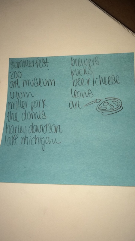
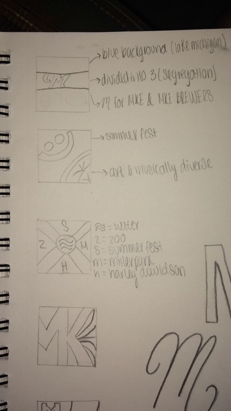
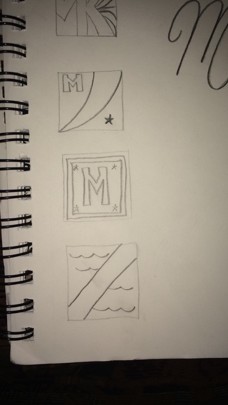
Before anything, I sketched all the ideas that were coming to me after we were introduced to the project. Since Milwaukee can be identified with multiple things, this project wasn't just matter of thinking and creating. I had to brainstorm a lot and think outside the box. Below are my brainstorming sketches. I did these sketches in little 1 inch x 1.5 inch boxes to make sure that I wasn't adding way to many things, and so that if it was to be hung up, it could be seen from a distance.
(Click on any photo to enlarge it.)
Planning
Before anything, I sketched all the ideas that were coming to me after we were introduced to the project. Since Milwaukee can be identified with multiple things, this project wasn't just matter of thinking and creating. I had to brainstorm a lot and think outside the box. Below are my brainstorming sketches. I did these sketches in little 1 inch x 1.5 inch boxes to make sure that I wasn't adding way to many things, and so that if it was to be hung up, it could be seen from a distance.
(Click on any photo to enlarge it.)
|
While planning, I also kept in mind these tips for creating a good design/flag.
|
 Flag of Milwaukee. "TED Talk Speaker Roman Mars Calls Milwaukee's Flag 'a Hot Mess'" TED Talk Speaker Roman Mars Calls Milwaukee's Flag 'a Hot Mess' N.p., n.d. Web. 10 Nov. 2015. Flag of Milwaukee. "TED Talk Speaker Roman Mars Calls Milwaukee's Flag 'a Hot Mess'" TED Talk Speaker Roman Mars Calls Milwaukee's Flag 'a Hot Mess' N.p., n.d. Web. 10 Nov. 2015.
|
Research
I did a little bit of research online and found many interesting facts about the original Milwaukee flag. I learned about some of the many symbols that it has, for example:
research URL: https://flagspot.net/flags/us-wi-mw.html
|
|
Designing Process
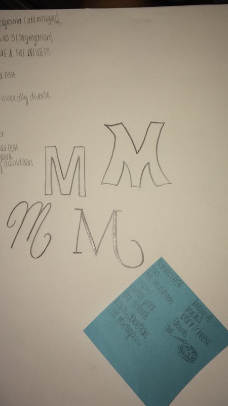
To create my flag design, I used Photoshop. I was going to create it manually, but I realized that it would be hard to make everything so perfect, so I decided to go with Photoshop, because it would make it neater and a lot more clear. I have to admit that Photoshop isn't my favorite, because since there's so many ways you can manipulate things, I get overwhelmed and usually don't even know where to start. The biggest visual in my piece are the rectangles, so that's what I started with. I created them one by one, and made sure they were aligned well to cover up any white lines in between. Afterwards, I added the "M", and the spiral-like barley inside the loop of the "M". Artistic Inspiration
The inspiration for this project wasn't a specific artist nor an art movement, but rather the flag of the country Bulgaria. My flag design reflects the simple design that the Bulgarian flag has, and although it's simple, it has deep meaning and symbolism. For example; in the Bulgarian flag, different elements represent different things. The red and white stripes represent the pan-Slavic colors (which are red, white, and blue). When the flag was designed, they chose a green stripe instead of the traditional blue to represent freedom. Again, it's simple, but meaningful. With my flag, it's the same thing. The colors and symbols are simple, but they represent what I think are the most important things in this city. |
|
|
Meaning of the Piece
The meaning behind my piece is quite short and simple. The thick orange stripe with a thin black stripe inside represents Harley-Davidson, because those are their colors, and because that is what the city is mostly recognized for; the motorcycles that come from this famous, and successful company. The navy blue stripe above that represents another really important thing about Milwaukee which is sports; and to be specific, baseball. The Brewers are known pretty much everywhere, and it's cool to know that they originate from here. Since the majority of people are big fans, I consider this yet another important thing from Milwaukee, which is why I incorporated them into my flag. The light blue stripe on top of this one represents the fresh water we enjoy that comes from Lake Michigan. This is a place where picnics are often held, and where the fourth of July is celebrated at, with fireworks, so it's also very important. The cursive-like "M" at the top just stands for "Milwaukee", and the spiral-shaped barley inside the loop of the "M" symbolizes how for much of our history, we've been the "beer capital of the world". |
|
Reflection
Overall, making this flag design was something that i enjoyed but not as much as I thought. I'd rather prefer making something that connects to me personally, and that comes from my ideas, but for this, I basically had to research history events to be able to make it, which is something that isn't really for me. I like that I was able to accomplish my intentions with it though, because I truly do believe that the four aspects I included are what really define and represent Milwaukee. When every I reflect on my city, those are the main things that pop into my head, which is why I included them in my flag.
Overall, making this flag design was something that i enjoyed but not as much as I thought. I'd rather prefer making something that connects to me personally, and that comes from my ideas, but for this, I basically had to research history events to be able to make it, which is something that isn't really for me. I like that I was able to accomplish my intentions with it though, because I truly do believe that the four aspects I included are what really define and represent Milwaukee. When every I reflect on my city, those are the main things that pop into my head, which is why I included them in my flag.
